One guardian, not a mascot
The dragon wraps around the monogram rather than standing beside it — protecting the initials, not competing with them, so the mark still reads as a monogram first.
Wedding Brand Identity
A full brand identity built for a wedding that wanted to feel like a story being told out loud — a monogram, a reversible color system, typography, and a stationery suite, all carrying one line: a love worthy of legend.
.png)
Couple's Vision
Kyra and Jim wanted their wedding to feel like the payoff of an adventure — the moment in the story where the promise finally gets kept. They didn't want twee fairy-tale cliches, and they didn't want anything that looked like it was trying too hard to be a "theme wedding." They wanted something that felt mythic without feeling like a costume.
That's a harder brief than it sounds. A dragon and a rose can tip into novelty in about one bad decision. The vision only works if the illustration is allowed to be dramatic while everything holding it up — the layout, the type, the restraint of the palette — stays completely composed.
Creative Direction
The direction, as written for the identity itself, draws "inspiration from timeless fantasy, medieval heraldry, enchanted forests, and classic romance" — the goal being for every element to feel like a page from an illuminated storybook, balancing strength with softness through dragons, roses, antique gold, and rich autumn color. That's a specific, deliberate mix — not "fantasy wedding" as a catch-all theme, but heraldry and forest and romance treated as three ingredients in one recipe.
The dragon coiling around the monogram, guarding it the way it might guard a hoard, is the one place the identity gets to be openly fantastical. Everywhere else — the centered invitation layout, the classic serif lettering, the single disciplined rose — stays traditionally elegant, the same way a well-told legend is dramatic in its events but composed in how it's told. The tagline that came out of this direction — "every great adventure begins with a single promise" — became the identity's actual thesis, the sentence the monogram, the palette, and the stationery are all quietly illustrating.
Brand Identity
The wedding itself moves from a daytime ceremony into a candlelit reception, so the identity was designed from day one to hold up in both — not as an afterthought, but as one of its founding decisions.
The dragon wraps around the monogram rather than standing beside it — protecting the initials, not competing with them, so the mark still reads as a monogram first.
One dark red rose and a bud, rendered with real botanical detail, keeps the romance grounded and specific instead of generic "fairy-tale florals."
Fine gold linework and a small fleur accent give the mark a formal, engraved quality without tipping into medieval pastiche.
Every asset exists in a light, parchment-based lockup and a dark, foil-ready lockup — one identity, built to answer to two different rooms and two different times of day.
The brand's own keyword list reads like a checklist for exactly this balance: enchanted, storybook, regal, romantic, noble, and warm on one side; ancient, adventurous, timeless, forest, cozy, and magical on the other. Half of that list pulls toward fantasy, half pulls toward comfort — and the identity's job was to let both sides show up in the same room.
Monogram
Rather than designing a second mark for evening use, the identity treats color as the variable — the same dragon, rose, and lettering, recolored for daylight print and for a dark, candlelit reception.
.png)
Nothing changes between the two lockups except color and finish — the dragon's pose, the rose's placement, the scrollwork, and the "EST. 2027" line all stay exactly where they are. That consistency is the point: a guest who saw the light version on a save the date should recognize the dark version on a place card without needing to be told it's the same wedding.
The dragon stands watch over the rose, symbolizing steadfast protection of love. The intertwined initials reflect two lives becoming one house, while the antique gold honors the legacy they begin together.
Typography
The type system pairs a tall, formal serif — the letterforms used for "K & J" in the monogram and for structural headings like "SAVE THE DATE" — with a loose, narrative script used for the couple's actual names and the tagline. The serif is the monument: upright, carved, permanent. The script is the telling: the part of a legend that gets passed down out loud, a little differently every time.
Keeping the tagline — "every great adventure begins with a single promise" — set in the same formal serif as the monogram, rather than the script, was a deliberate choice: it reads less like a caption and more like something carved under a coat of arms, which is exactly the register the whole identity is aiming for.
Color Palette
Oxblood, gold, and parchment run through both lockups; only which one leads and which one recedes changes between the day version and the night version.
Stationery System
The first piece in the suite was designed to feel like the opening of a story — a border, a crest, and a tagline, arranged the way a book announces itself before the first chapter.
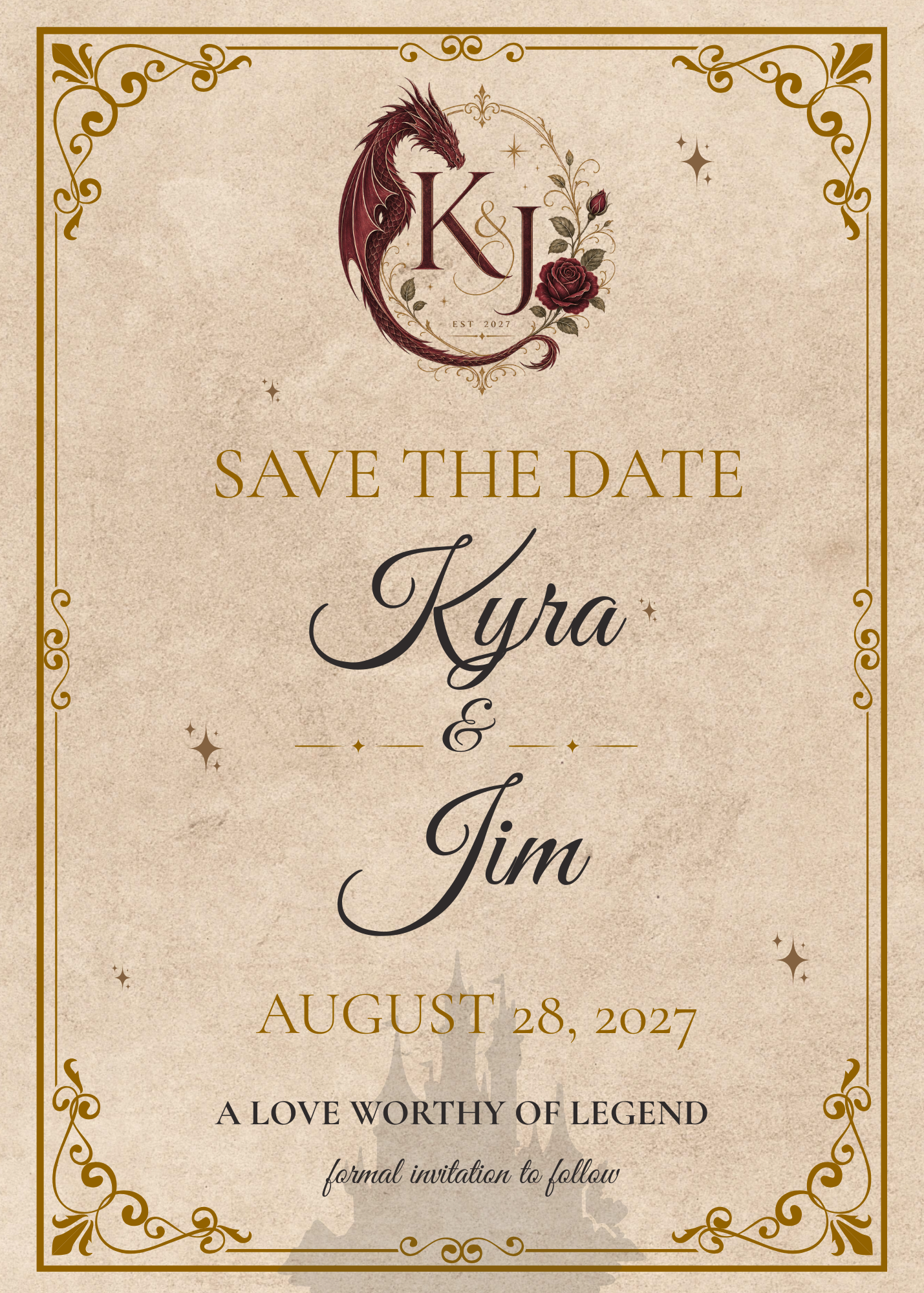
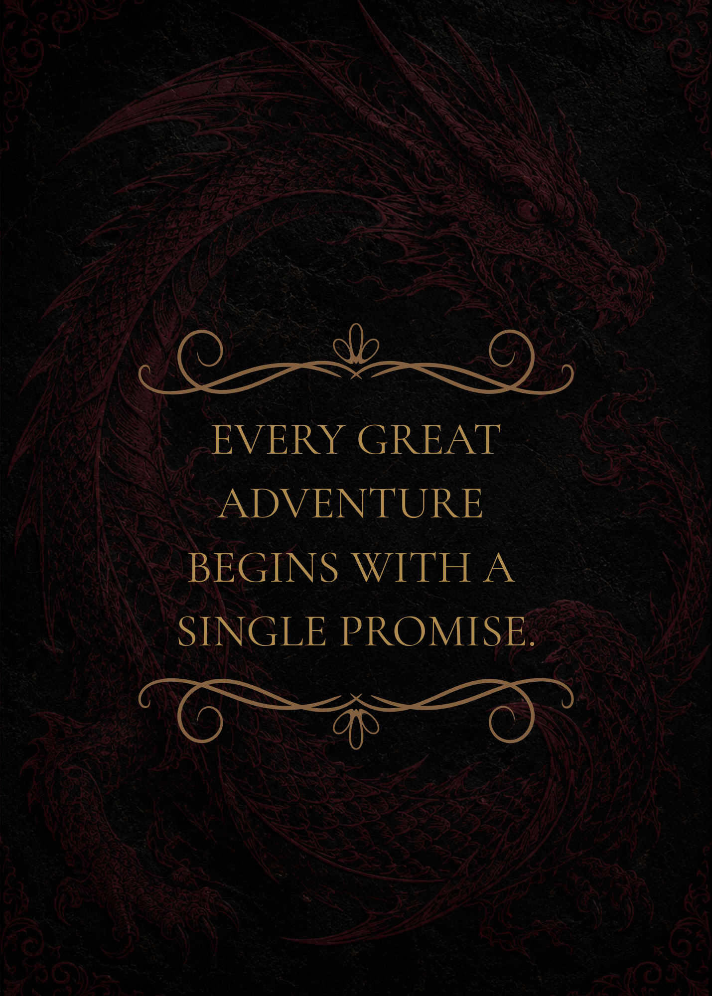
The front carries the light lockup and does the introducing — names, date, tagline, a castle silhouette watermarked low enough to feel like a setting rather than a costume. The back flips to the dark lockup entirely, using the full bleed to let the dragon texture and the tagline breathe with nothing else competing for attention — effectively a preview of what the reception's night-time pieces will feel like. The same structure extends forward into menus, place cards, and a welcome sign, each one choosing the light or dark lockup based on which room it lives in.
Reflection
"The dragon was never the risky part. The restraint around it was."
A motif this bold only reads as elegant because everything around it — the centered layout, the classic serif, the single rose — refuses to compete with it. Take away that restraint and the same dragon becomes a costume instead of a crest.
Building the dark lockup alongside the light one — instead of inverting colors later under deadline — meant both versions actually feel intentional, not like a printer setting.
"A love worthy of legend" isn't a pretty sentence bolted onto the design after the fact — every decision in the identity, from the guardian dragon to the day/night system, exists to make that one line true.
Let's Talk
Every couple's day has a shape to it, whether it's mythic and dramatic or quiet and intimate. That shape is the starting point for a brand identity built around your day — not just a matching stack of paper.