Celestial motif
A crescent moon and scattered stars appear across every piece, at every scale — the throughline that ties the monogram to the save the date to the invitation's border.
Wedding Brand Identity
A full reception visual identity for a wedding beneath the aurora — a monogram, a named color system, a four-font typography system, signature textures, and a stationery suite, all built from one idea before a single invitation was designed.
Couple's Vision
Kelly and Josh didn't come in with a color palette or a Pinterest board of florals — they came in with a feeling, and a short list of words that ended up doing more work than any mood board could: whimsical, cozy, starlit, gathering, fellowship. They wanted their reception to feel like a storybook chapter shared with the people they love — quiet and a little awestruck where the aurora shows up, and warm and unpretentious everywhere else.
That "fellowship" idea mattered as much as the aurora did. This wasn't a couple asking for an untouchable, precious atmosphere — the brief explicitly called for something inclusive and relaxed, a night that felt like an adventure shared with everyone in the room, not a mood too fragile for anyone to enjoy.
Creative Direction
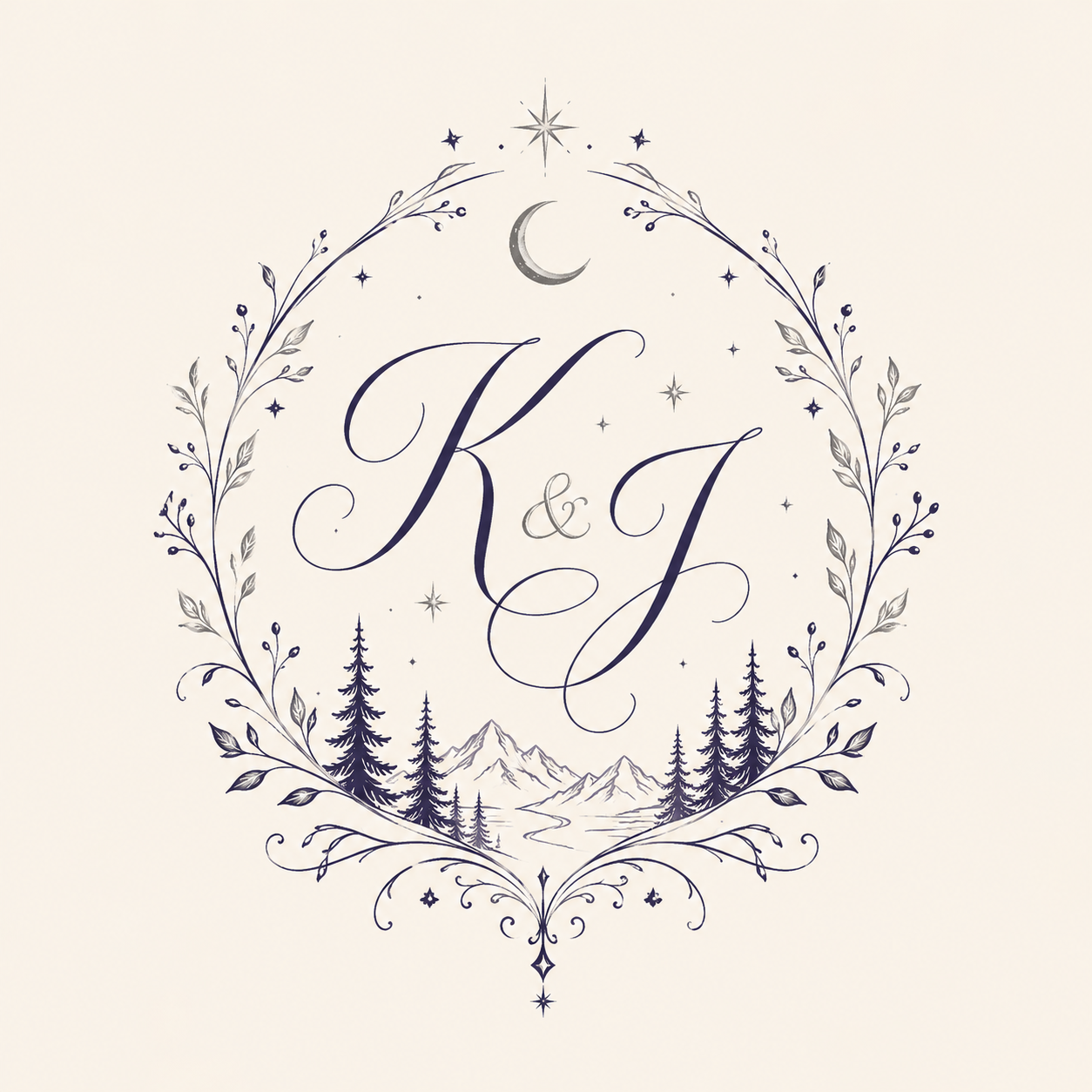
The creative direction landed somewhere between celestial elegance and storybook fantasy — an evergreen forest, ancient magic, mountain air, all filtered through a warm, cozy lens rather than a cold or untouchable one. A single recurring landscape — pine trees, a mountain range, and a still lake beneath a crescent moon — was rendered once as a detailed vignette, then reused across the monogram, the save the date's full night sky, and the invitation, so every piece pointed back to the same place instead of introducing new artwork each time.
The direction also reached past paper. A short set of signature textures — Aurora Silk, Starlight Velvet, Crystal Frost, Moonstone Lace — was chosen to carry the same feeling into fabric, glassware, and table linens, and even the reception's wayfinding got pulled into the story: this is a wedding where the welcome sign says "Welcome, Traveler" instead of "Welcome, Guests." Nothing in the identity was allowed to stay purely decorative when it could also be part of the story.
Brand Identity
Every piece — the monogram, the typography, the palette, the stationery — was designed to answer to the same visual language, so a guest could recognize the wedding from a single detail: a star, a pine bough, a shade of navy.
A crescent moon and scattered stars appear across every piece, at every scale — the throughline that ties the monogram to the save the date to the invitation's border.
The same pine-and-mountain vignette anchors the monogram, the save the date photography, and the invitation — never redrawn from scratch, always the same place.
Aurora Silk, Starlight Velvet, Crystal Frost, and Moonstone Lace name the materials the identity expects to live on — fabric and glass, not just paper.
Every element was tested reversed — light ink on dark, and dark ink on light — because the reception itself moves from daylight into a night lit by the aurora.
The identity even extends into how the reception space is talked about. Each area of the night got renamed into the same fellowship-and-adventure language guests would recognize from the invitation:
Welcome — "Welcome, Traveler"
Reception — "The Celebration"
Dinner — "The Feast"
Desserts — "Sweet Hearth"
Drinks — "The Tavern"
Quiet Room — "The Quiet Grove"
Board Games — "Hall of Games"
Mario Kart — "The Grand Prix"
Gifts — "Gifts for the Journey"
Exit — "Safe Travels"
Monogram
Rather than a single monogram, Kelly & Josh's identity carries two intentional lockups of the same idea, so it can flex between a romantic hero placement and a small, legible mark.
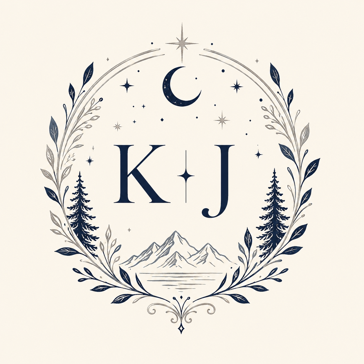
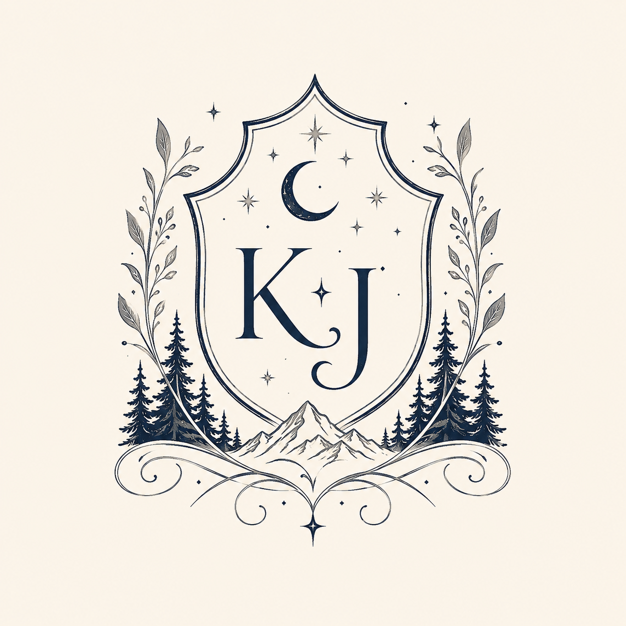
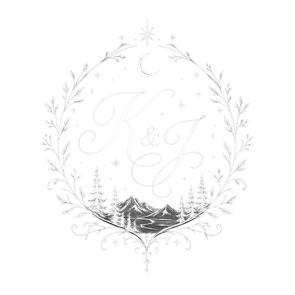
The flowing script "K & J" is the emotional lockup — the one that appears where the mark is allowed to be the star, like the save the date and the invitation's opening moment. The small-caps "K · J," separated by a single star, is the working lockup — sturdier at a glance, built for places where the monogram has to share space with other information or get engraved into something smaller than a card. Housing the same small-caps version in both a wreath and a pointed shield meant the couple could move between a soft, botanical framing and a more formal, heraldic one without introducing a second monogram entirely.
Typography
The type system runs on four typefaces, and none of them are asked to do more than one thing. Cardo, bold, carries every heading — the weight that makes "Save the Date" and "Kelly & Josh" feel like the moment they are. Migra, a quieter serif, handles body copy — the practical lines a guest actually reads to know where and when to show up. Marcellus steps in as a second accent voice, upright and a little more formal, for the in-between moments that need presence without shouting. Great Vibes, a flowing script, is reserved for the most personal lines — the couple's names, the wreath monogram's ampersand — so the handwriting only shows up where the piece is actually being personal.
Splitting the work this specifically — rather than leaning on one "wedding font" for everything — is what lets the identity move between a formal invitation, a playful reception sign, and an engraved monogram without ever feeling like it's wearing a costume for the occasion.
Color Palette
Eight named colors move from deep celestial neutrals to two aurora accents — magenta and teal — used deliberately, so the sky gets to appear in the palette itself without ever taking it over.
Stationery System
Each piece was designed as the next chapter of the same story rather than a fresh layout — the save the date sets the scene, and the invitation delivers on it.
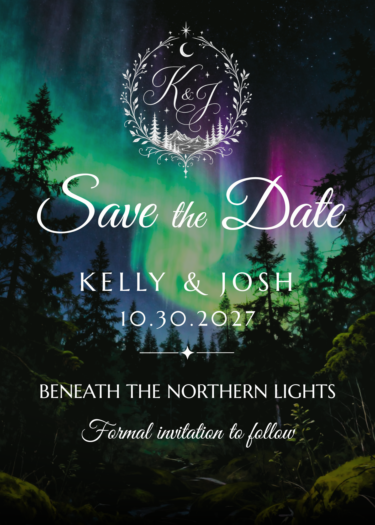
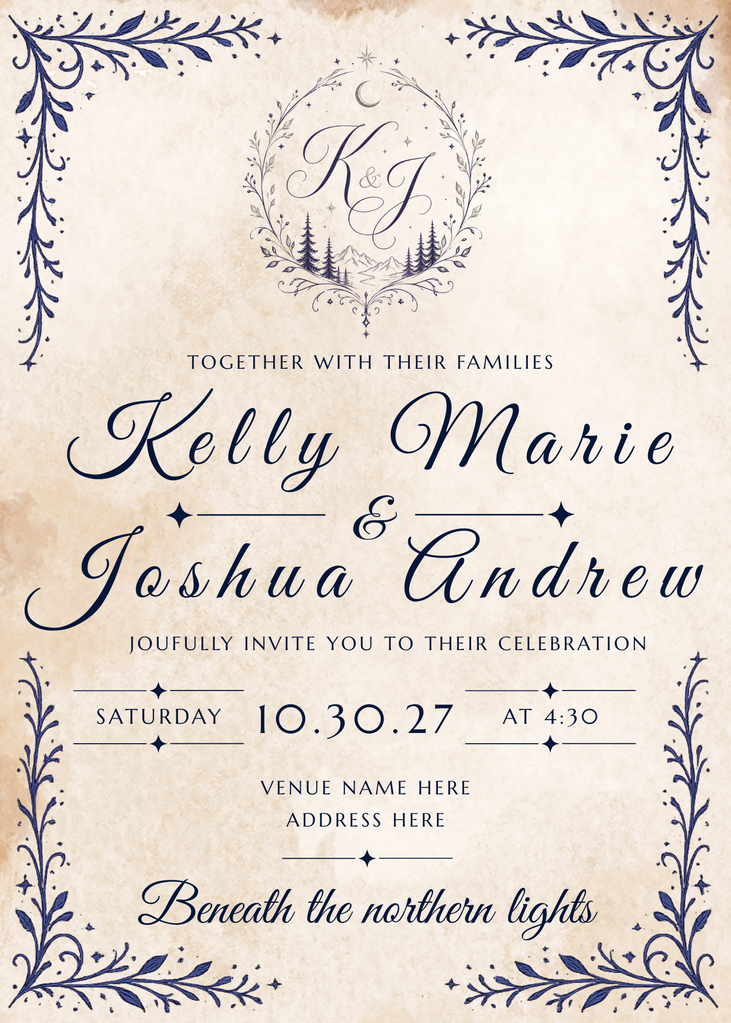
The save the date is allowed to be photographic and a little dramatic — it's the first thing anyone sees, so it gets the full sky. The invitation pulls back to parchment and line art, trading the photograph for restraint, because by the time it arrives, the couple doesn't need to sell the mood again — they need to tell people where and when to show up, beautifully. The same logic extends the system forward: programs, table numbers, and a welcome sign would inherit the parchment-and-navy treatment and the shield lockup, built for something more durable than paper.
Reflection
"The hardest part wasn't including the aurora. It was making sure it didn't take over."
The instinct with a subject this beautiful is to put it everywhere. Naming Aurora Magenta and Aurora Teal as two accents inside a mostly navy-and-ivory palette — instead of letting the whole suite go purple and green — is what keeps the identity from feeling like a photo filter instead of a brand.
Designing a second monogram lockup from the start — instead of only realizing later that the script version couldn't survive a small engraving — meant the couple never had to choose between the emotional mark and the practical one.
Nothing here was designed piece by piece. The monogram, the palette, and a four-font type system existed before the save the date did — and it's why a "Welcome, Traveler" sign at the reception can feel like it belongs to the same wedding as an engraved wax seal.
Let's Talk
Every couple has one, whether or not they've put words to it yet. That's the starting point for a brand identity built around your day, from the monogram to the last program on the last chair.